The Insights report helps you visualize the data from various parts of your organization. For a specific set of teams, systems and organizations, you can see average scores per stage, scores per Agile capability as well as see trends like highest and lowest scoring capabilities. You can visualize the data for a chosen time period, a specific assessment, compare two time periods, or compare data from different assessments.

Elements
Filter Controls

- Level of assessment data: Choose between either organization, system, or team level data. This will affect the level of node that you are able to select from the next input.
- Stages: Toggle on or off including data for specific Path to Agility stages.
- Node selection (organization/system/team): Clicking this input will open a dialogue to choose exactly which nodes from the company to include in the report. If you're currently working in an organization, that organization will be selected by default.
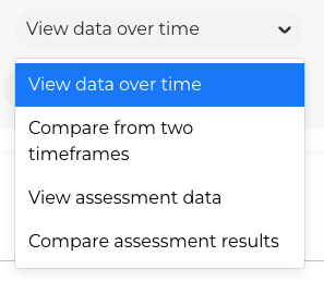
- Data Selection: Choose from "View Data Over Time", "Compare Two Time Frames", "View Assessment Data", or "Compare Assessment Results". This choice will allow other options to be selected on the second row.
- Date range: Choose the timeframe for the data you would like to view. By default, this is set to 3 months. If you'd like to view all possible data, choose "Most recent data". This option is disabled if assessment selection is used.
- Second Timeframe: If "Compare from Two Timeframes" is selected, then this dropdown will be available.
- Assessment selection: If desired, you may instead choose to filter your subsets of data by assessment. This is only available if the nodes selected are located within a single organization, not across multiple organizations.
- Second Assessment: If an assessment is selected, the drop down to select an assessment to compare to will be activated. This allows for the comparison of data between the two assessments based on the other filter settings. See the Comparison section below for more information.

Visualization

This visualization shows the scores of each capability's score by each stage. The average score for each stage is shown at the top of each stage's graph.
On the top right, the visualization can be configured.
- Visual Mode
- Average: averages the scores for all of the included nodes together (that have scores for the capability)
- Distribution: displays each of the scores as an individual unit, including the nodes that do not have scores
- Show labels: Whether or not to include the capability's names
- Visualization Type
- Bar graph: Shows the data with a different bar graph for each stage, as seen in the figure above
- Heatmap: Shows the data similar to the Capabilities page
Comparison
The Comparison feature provides a view of data from two different assessments. The granularity of the data is controlled by the filter controls (see above) which specify level, nodes, and stages to be included in the comparison. In the comparison view, the older assessment will be listed before the newer one. Similarly, in the chart, the data for the older one will be on the left with the data for the more recent assessment on the right. This allows users to easily pick two assessments to compare with a consistent, chronologically ordered view of the results.

Insights

This section provides highlights of the data from above for easier consumption. Of the selected nodes, it lists the highest scoring capabilities, the lowest scoring capabilities, and the highest priority capabilities to make progress on, based on the same P2A Index algorithm as in Prioritization.
You can click the "Summarize with AI" button to synthesize the data into a written paragraph explaining the insights and trends found.
Capabilities can be clicked on to open a side panel with more information about the capability (such as written Notes, Actions, or the score History).

