Scores allows organization and company leadership to roll up data across varying sets of organizations, systems, and teams into aggregates for greater visualization and discovery.
Scores filters
When viewing the Scores report, you can adjust what data is displayed by using various filters on the top of the page.

Assessment Data Level
View data for the Organization level, System level, Team level, or All Levels.
Organization(s)
Click Change Selection to modify which organizations' data is visible on the dashboard.
Date Range
Use the date range dropdown to select assessment data to be included:

The date range will default to the previous 3 months from today.
Assessment
Alternatively, you can use the assessment dropdown to select an assessment to be included. You cannot use both the assessment dropdown and the date range dropdown together.
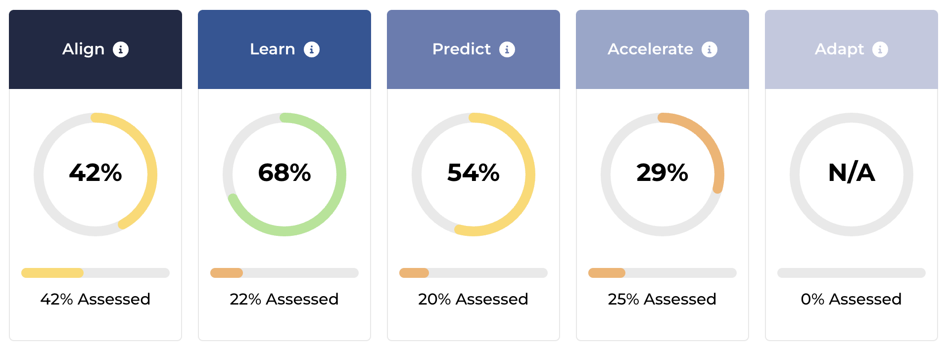
Business Outcomes & Stages
Based on the filter settings (the assessment level, organization(s) selected, and the date range), the aggregated scores of the various Path to Agility Business Outcomes and Stages are visible. The percentage shown inside the circle is the score calculated by aggregating the individual scores for various capabilities that contribute to that Business outcome and Stage. The % Assessed describes the participation percentage i.e. the percentage of capabilities that are assessed within that Stage.
Business Outcomes

Stages

Detailed Data Breakdown
Under the Business Outcome and Stage visualizations, there is an expandable accordion where you can explore the numbers in greater detail. CS stands for Capability Score which is the aggregate for that level and stage, while CA stands for Capabilities Assessed which is the percentage of the capabilities that have been assessed in that stage for all of the teams/ systems/ organizations in that level.

Company Map
Company map displays data for the organizations selected based on the filters at the top of the page. Agile Outcomes may be clicked to view the capabilities inside of them, and they are colored based on their score (the black pill-shaped icon in the bottom right of each Agile Outcome). The Map highlights the dependency mapping between each of the Agile Outcomes (and thus Agile Capabilities) within Path to Agility.

